Psi Grid Score
The grid score source code can be found at: https://gitlab.tubit.tu-berlin.de/simonweber/gridscore
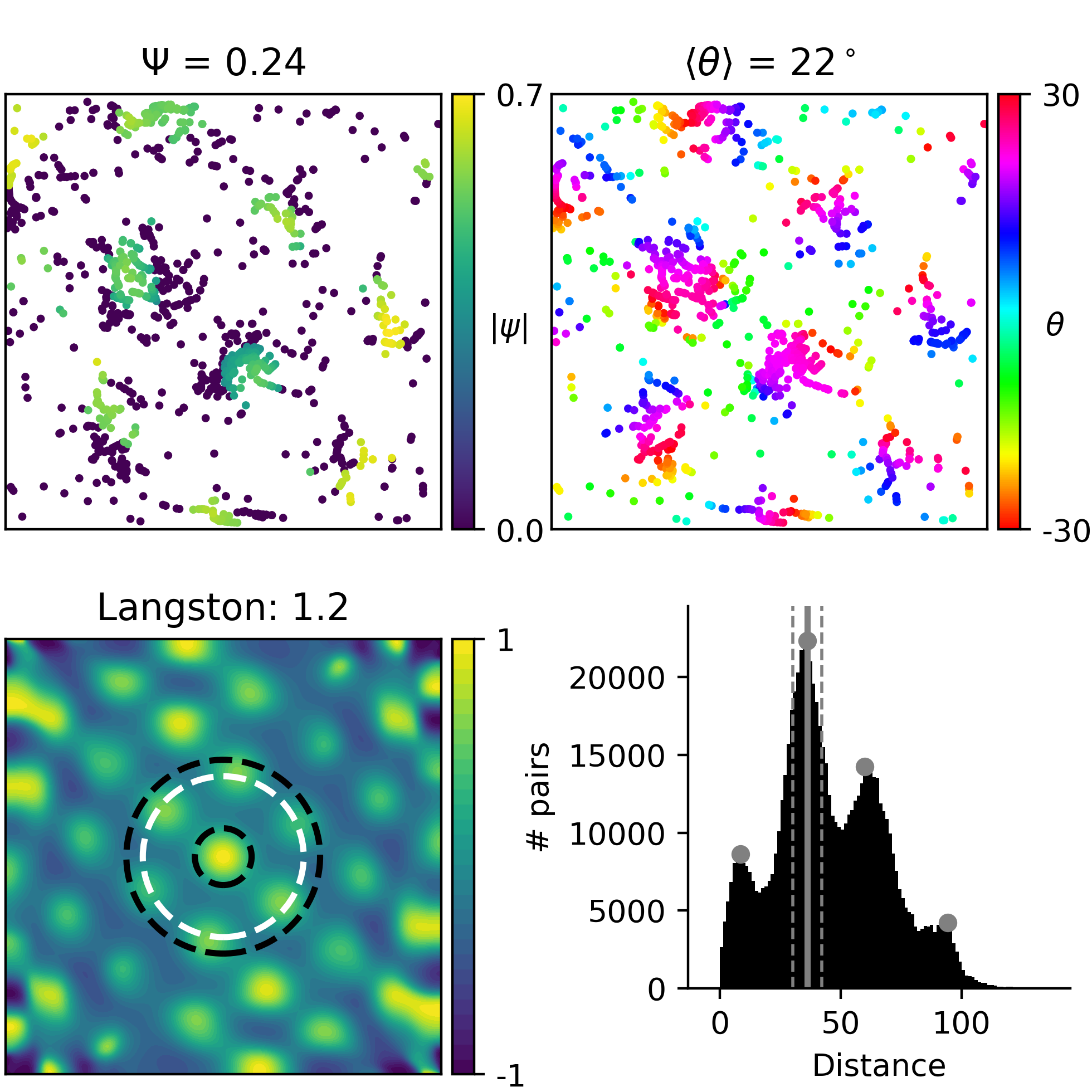
EXAMPLE with spike positions. Courtesy of Sargolini et al. 2006. Shape of data: (1223, 2)
|
Local
grid scores Each dot represents the location of a spike. The color of a dot represents its individual Psi grid score. Bright colors correspond to high grid scores. Title: Mean over the grid scores of all spikes. |
|
Local
orientations Each dot represents the location of a spike. The color of a dot represents the orientation of the grid around this spike. For a hexagonal symmetry, orientations vary between -30 and 30 degrees (see cyclic colorbar). Title: Mean over the orientation of all spikes. |
|
Correlogram
The autocorrelogram of a rate map of the spike positions. The underlying rate map was obtained by filtering the spike positions with a Gaussian kernel. The autocorrelogram was then obtained by Pearson correlating the rate map with shifted versions of itself. These correlations are obtained for every possible displacement. Therefore the size of the autocorrelogram is twice the size of the arena. Black circles show inner and outer doughnut radii obtained as described in the grid score of Langston et al. 2010. The white circle indicates the detected grid spacing. Title: Resulting Langston grid score.
|
Distance
histogram Histogram of distances between all pairs for spikes. Gray dots show detected peaks. The solid gray line highlights the radius of the neighborhood shell used for the PSI score. The dashed gray lines indicate the width of the shell. For spike positions, the second peak should be detected. |
|
Example with spike positions
The PSI score for spikes of an experimentally recorded grid cell. Data from Sargolini et al. 2006 obtained from http://www.ntnu.edu/kavli/research/grid-cell-data
|
Example with field positions
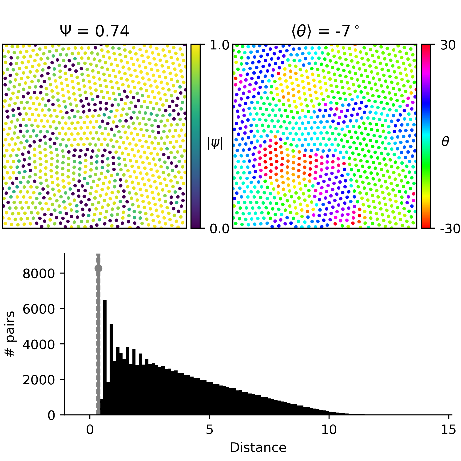 The PSI score for fields of grid cells from simulations. Data provided courtesy of Sophie Rosay.
|
Website created by Gregory Knoll, October 2017.
Grid score developed by Simon N. Weber and Henning Sprekeler